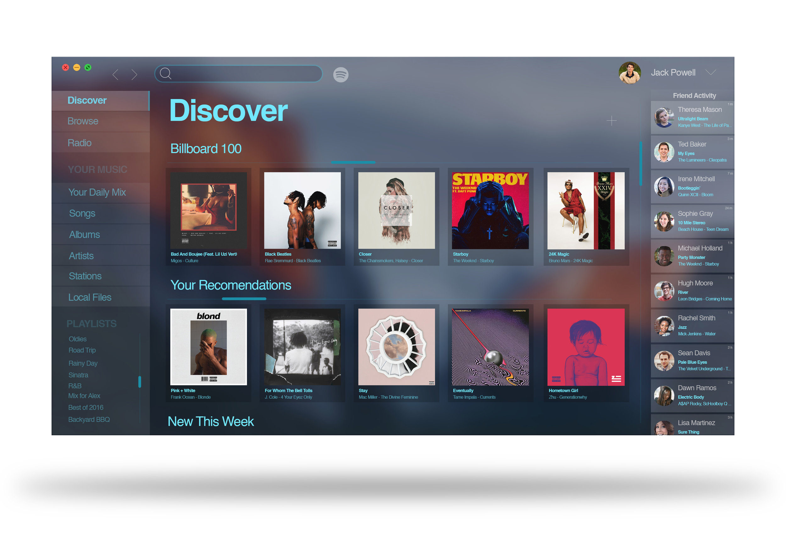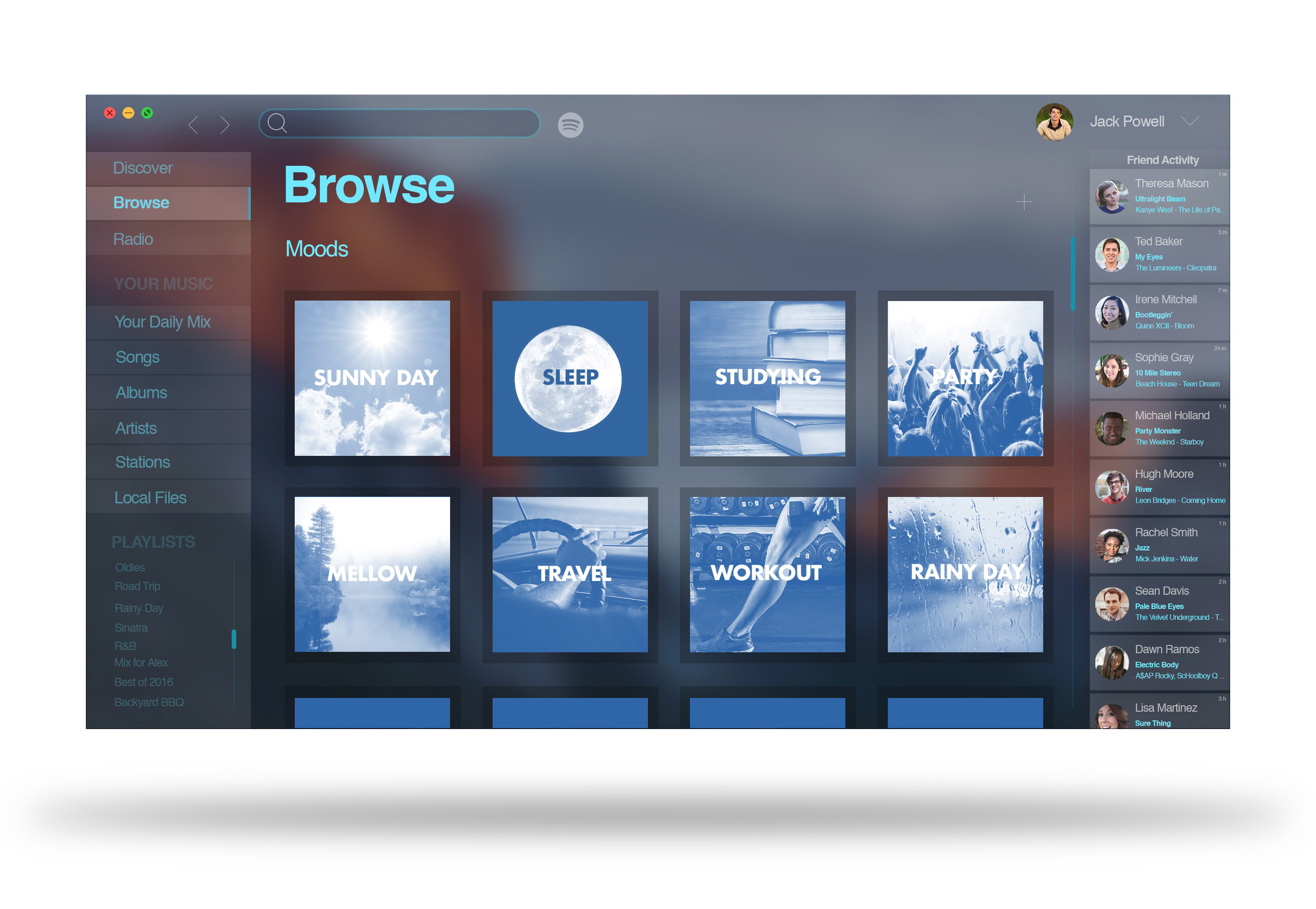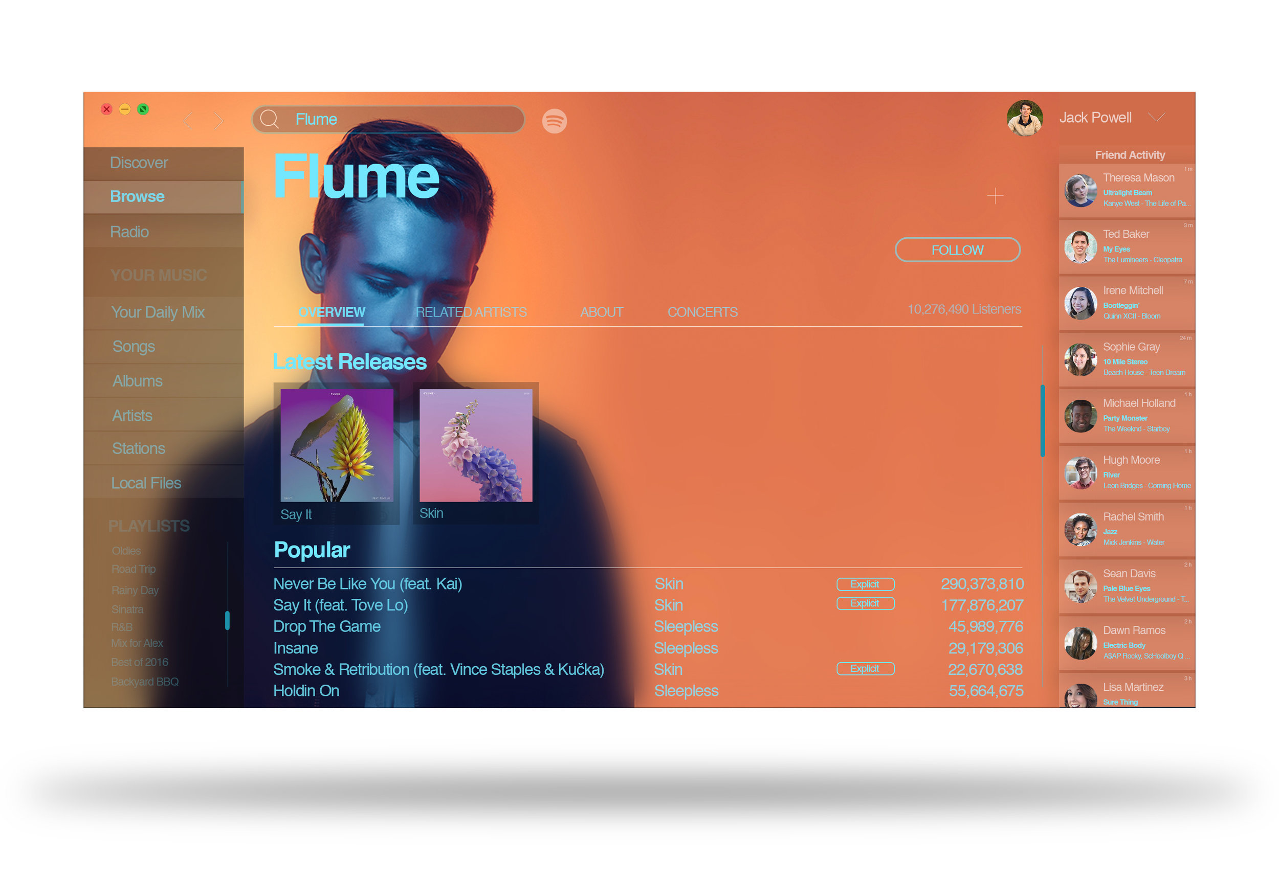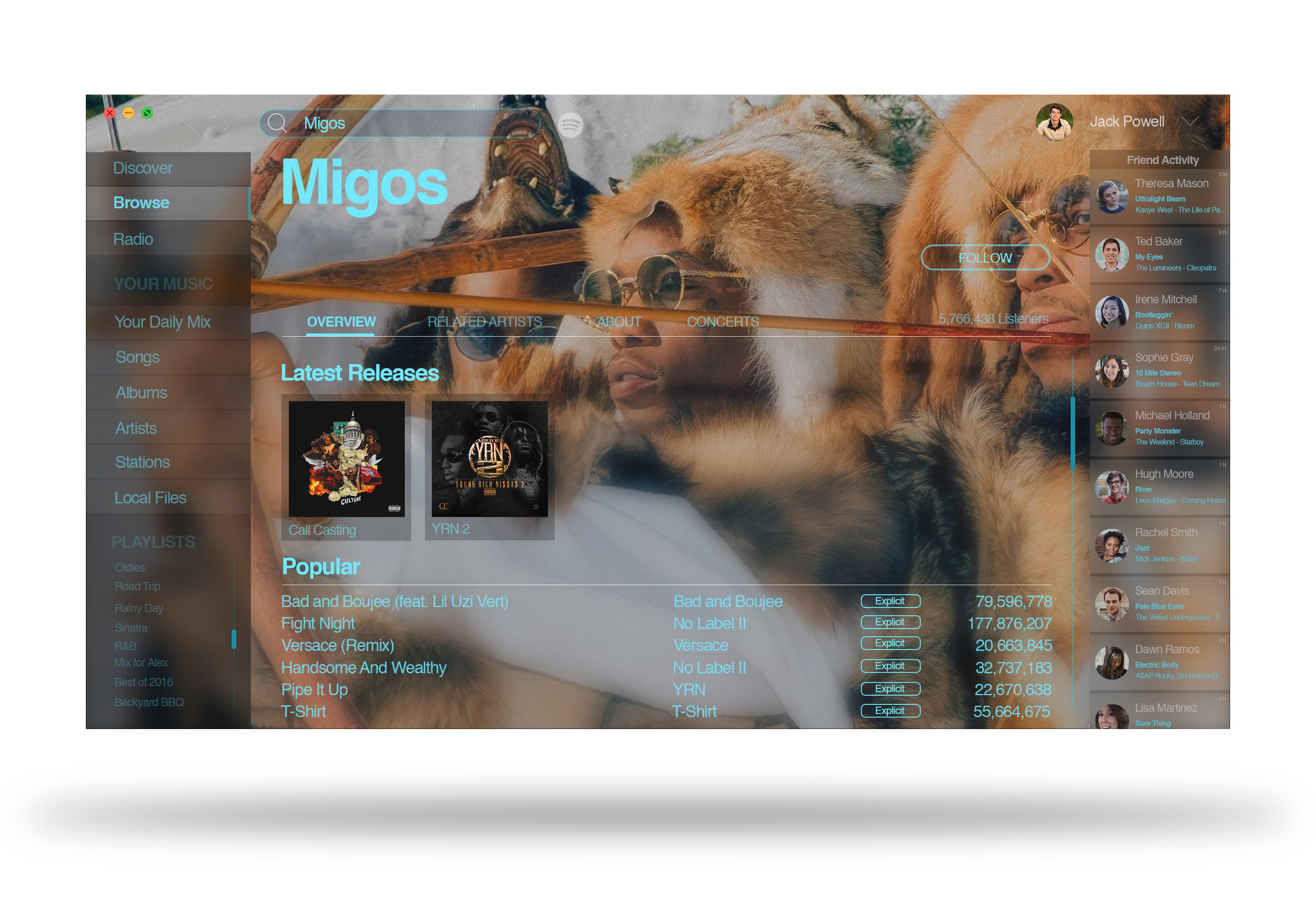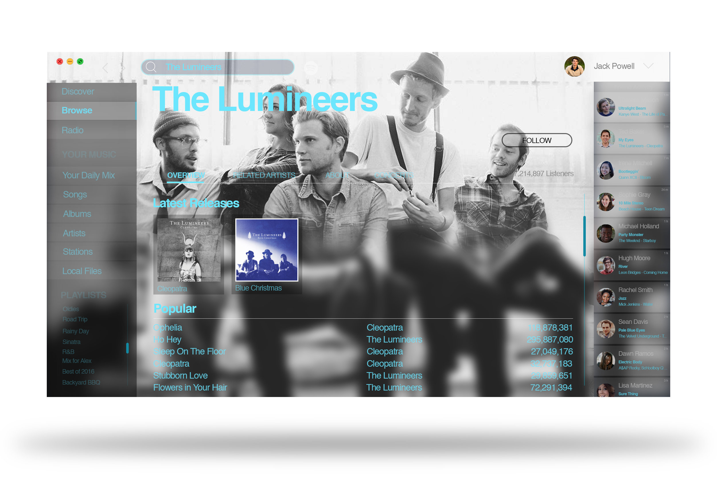


Spotify is a music streaming platform that in recent years has taken off and completely changed the industry. I began using Spotify back in 2013 and while I have absolutely loved the service, one thing has always bothered me about the program: its user interface. I have always felt that their dark, shades-of-grey-and-accents-ofgreen interface is unimaginative, boring and wasteful, especially because of the potential to make such a platform vibrant, engaging and beautiful. I took it upon myself to design the interface I wanted to use; one that would enhance my personal experience with Spotify, and hopefully that of others who use it as well. Full-window customized artists pages, semi translucent panels and minimalistic arrays make for a cleaner and more eye catching interface which makes music the focus. The redesign takes advantage of the effort that artists have already put in to making their visual branding and showcases it for a more striking musical experience for the user.