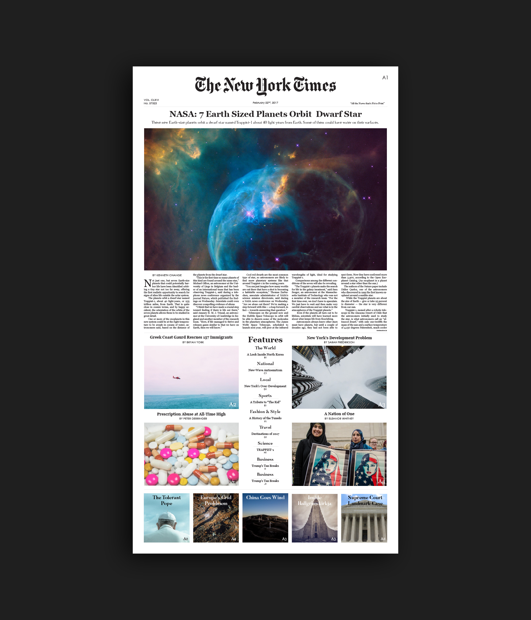
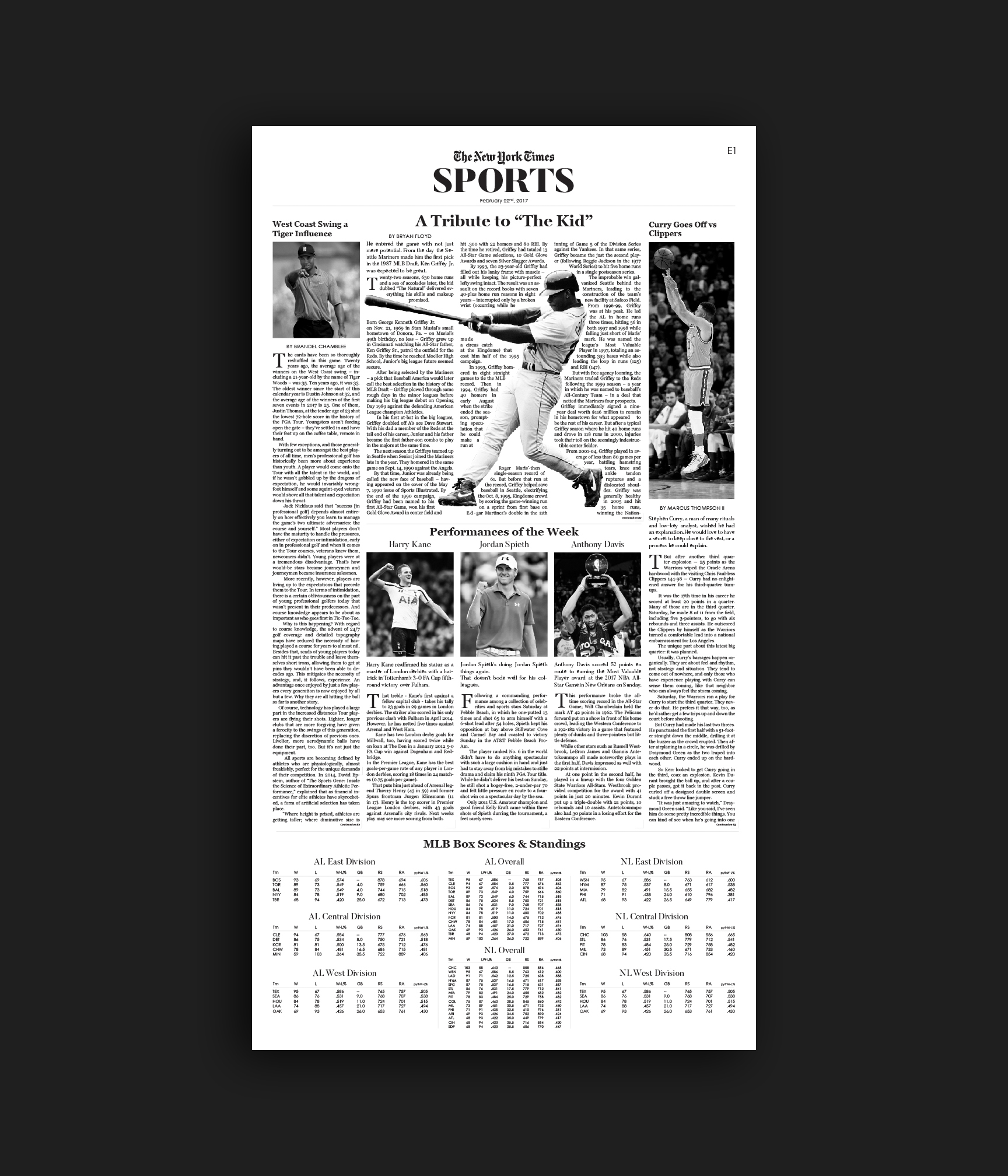
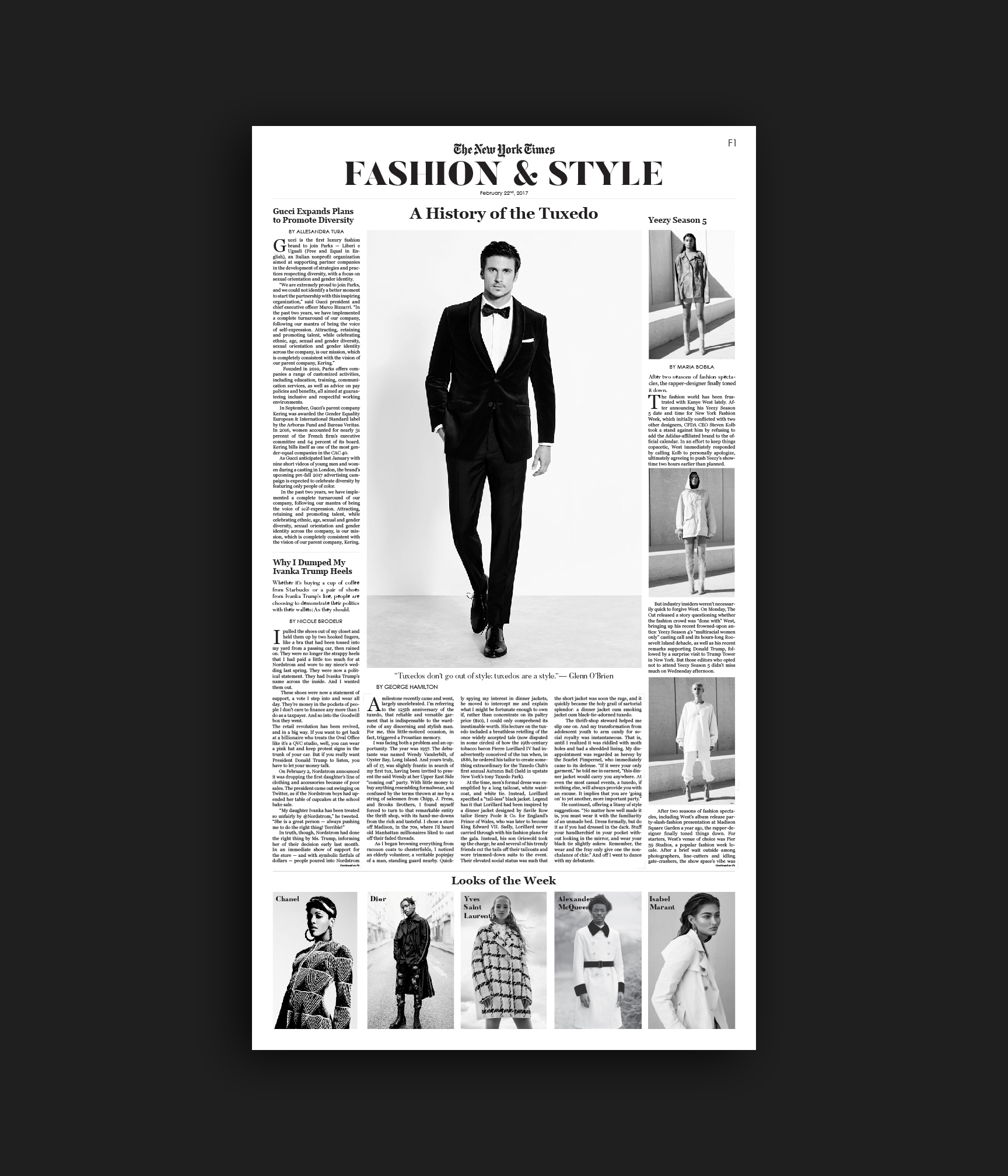
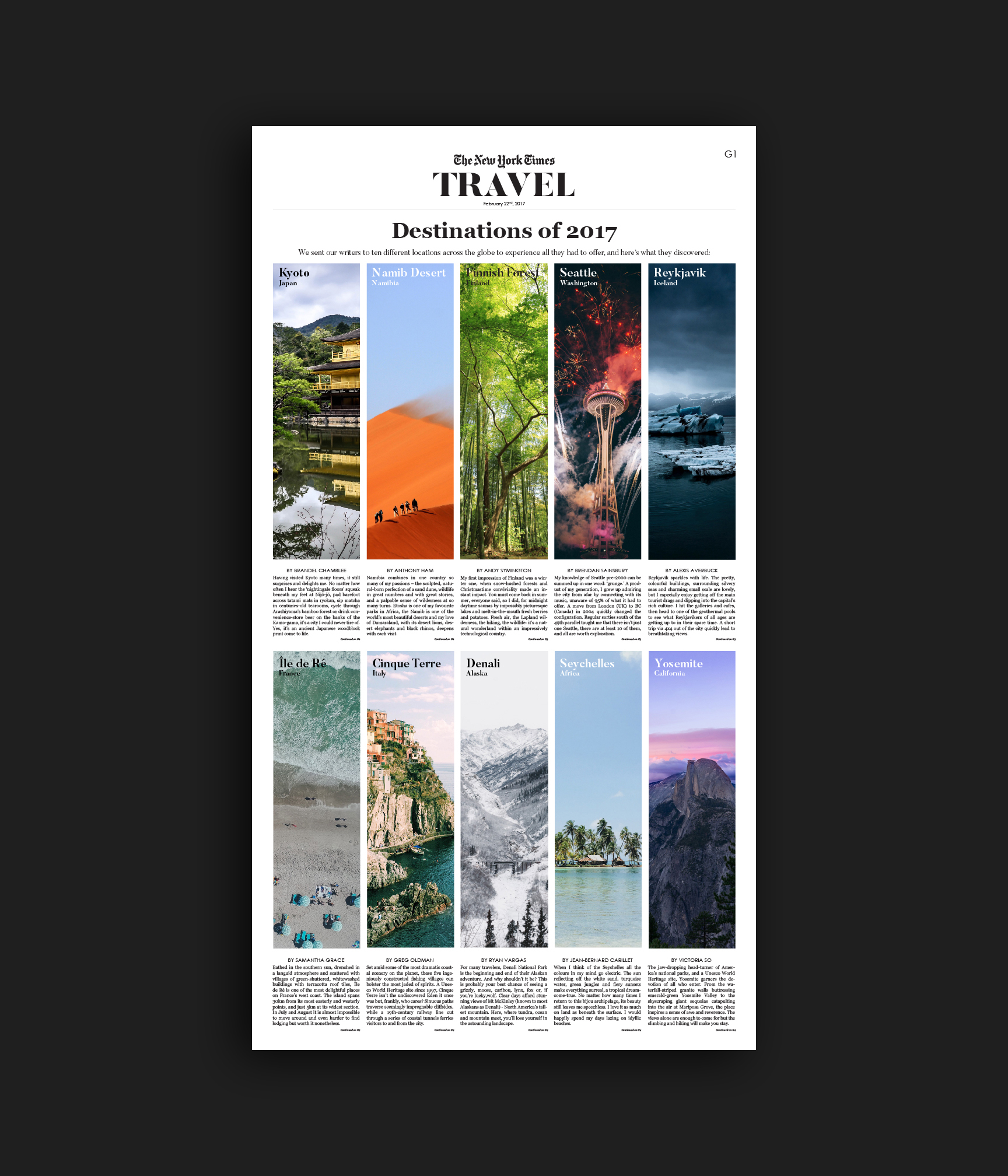
For over a century and a half, the New York times has been revered as the preemptive source for news and opinions. The Gray Lady and her prominent masthead are familiar to millions of people across the globe. The assignment was to redesignin both the print and web publications in an effort to modernize the paper. I focused my efforts on the front page as well as the Sports, Fashion and Style, and Travel sections. I approached the project with three main goals in mind: 1) to eliminate any visual noise that was cluttering the spreads 2) to maximize the use of photography and imagery to create visual interest and 3) to improve cohesion between the print and online publications. To tackle my first goal, I implemented a new system of breaks which distinguish articles and direct readers along the page. Instead of the harsh black lines that most newspapers use, I employed a system of subtle gray corner frames. Around 50% of each spread is taken over by photography with the exception of the Sports section in which imagery is less important. Currently the New York Times uses a different type palette online versus in print. I chose my type palette based on each fonts readability and legibility on screen and on paper. Synchronizing the fonts allows for more familiarity between the two platforms and will help draw readers from the younger demographic to print and readers from the older demographic to the web. I utilized strict column rules, five for print, four for web, to regiment the images and text into a logical format. The redesign yields a New York times better suited for the 21st century.


